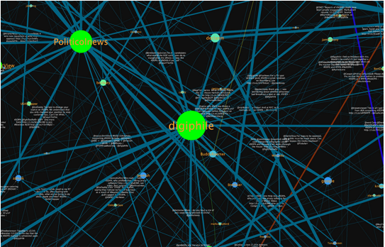
Kickstarter data dude Fred Berenson visualized conversations around SOPA on Twitter: View visualization

His data crunching strongly implies that I’ve been a “supernode” on this story. I’m not surprised, given how closely I’ve been following how the Web is changing Washington — or vice versa.
